Stupepie!
- Packaging
- Concept
- 2024
Information
월간 <디자인> 9월호: 디자이너의 사이드 프로젝트
Stupepie!
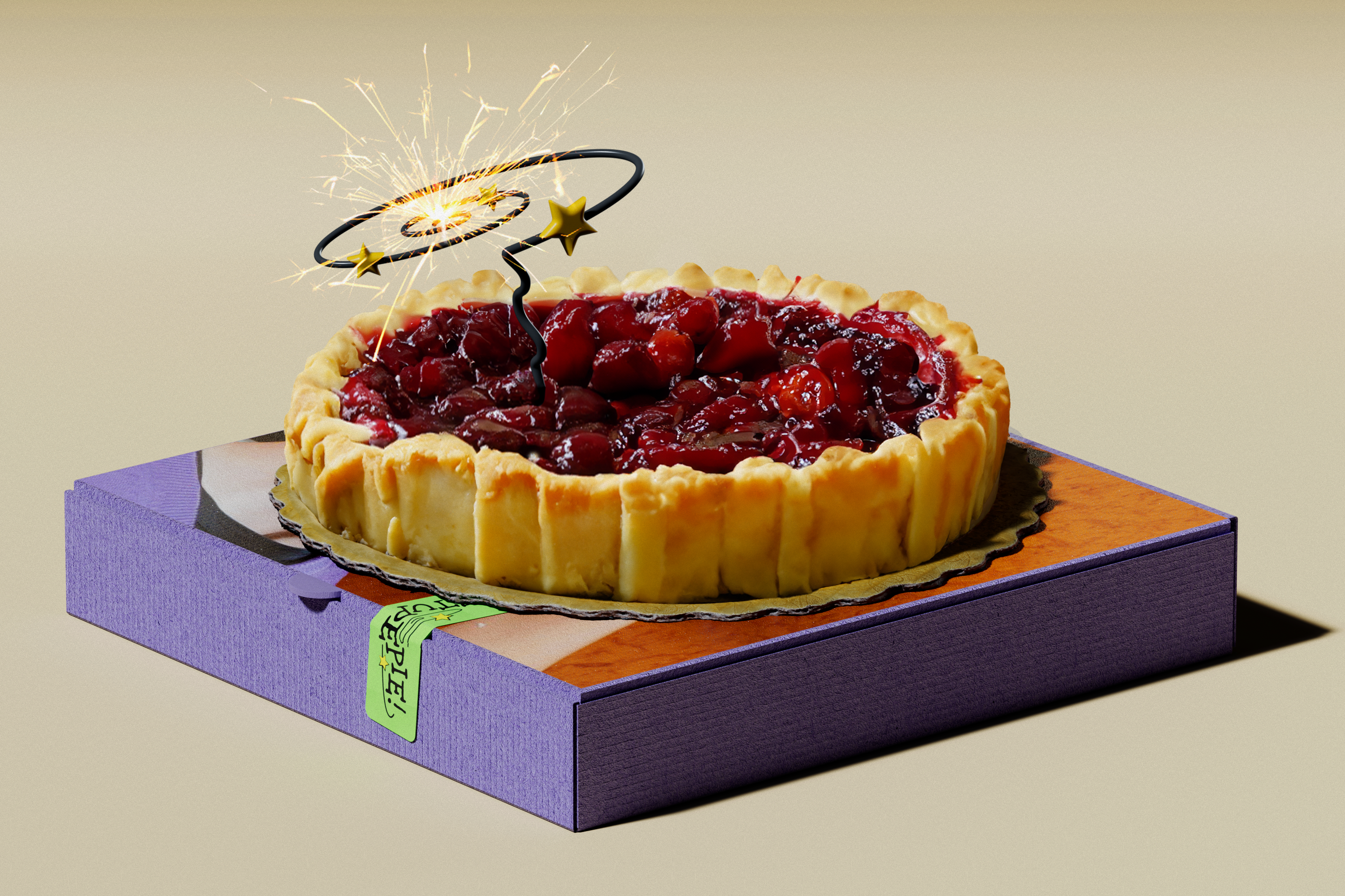
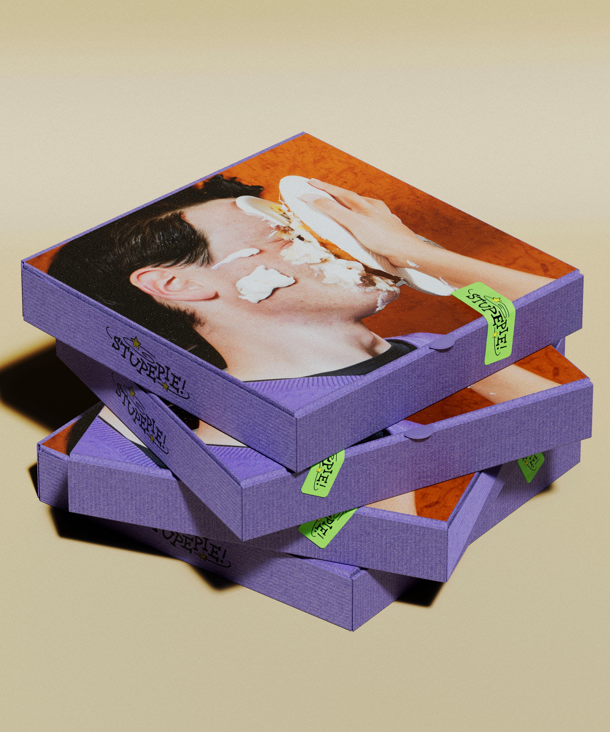
언젠가 스포티파이, 새티스파이(satisfy) 등의 단어로 메뉴를 개발해 파이샵을 여는 상상을 했었다. 스투페파이는 판타지 소설 ‘해리 포터’ 시리즈에 나오는 기절 주문에서 가져온 이름이다. 맛있어서 기절한다는 뜻이다. 만화에서 어지러움이나 기절을 표현할 때 쓰는 나선과 별을 활용해 로고를 제작했다. 패키지에는 인상 깊은 한 방이 필요할 것 같아, 얼굴에 파이를 맞는 이미지를 넣었다. 친근한 파이를 원하지만, 대신 나선형의 스파클라 폭죽 초로 포인트를 주기로 했다. 파이 장사에 관심 있는 누군가에게 정말로 연락이 왔으면 좋겠다.
There was a time we imagined opening a pie shop with menu names inspired by words like Spotify(Spotipie) and Satisfy(Satispie). Stupepie takes its name from the stunning spell in the Harry Potter series — meaning it’s so good, it’ll knock you out. For the logo, we used spirals and stars — the classic comic book symbols of dizziness or being knocked unconscious. We figured the packaging needed a strong visual punch, so added an image of someone getting pied in the face.
We wanted a friendly, inviting kind of pie — but with a twist. So we gave it a sparkle candle shaped like a spiral firework.
We secretly hope someone who’s actually interested in selling pies will reach out to me someday!
Logo